Creating wireframes is an essential step in the planning process for your project. They help stakeholders visualize layout, navigation, and functionality before design and development begin. This ensures that everyone involved has a clear understanding of the project's goals and user experience goals.
Below, we'll examine wireframes, their different types, and key elements to give you a clear understanding of how to create wireframes that effectively convey your project's vision.
What Is a Wireframe?
A wireframe is a simple representation of the layout and interface of a web page or application. In it, you can describe the placement of key elements, such as navigation, content, and interactive features, without focusing on design details such as colors or typography. Frameworks serve as a blueprint to guide the development team and ensure the project's goals are achieved.

Types of Wireframes
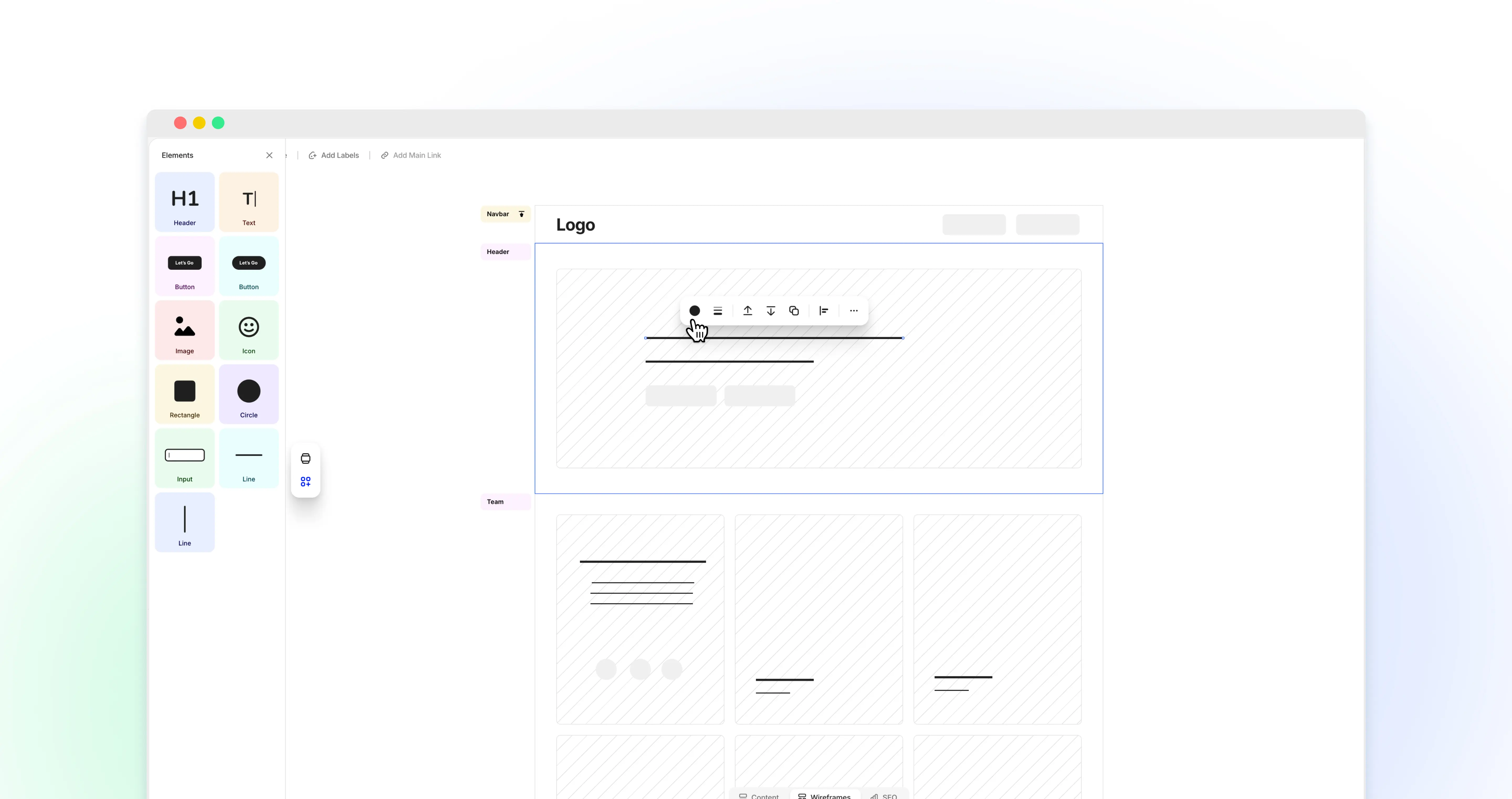
Low-fidelity
Low-fidelity wireframes are basic sketches, often created with simple shapes and lines. They focus on the overall structure and layout without delving into details. These wireframes are quick to create and are useful for initial brainstorming and discussions.

Mid-fidelity
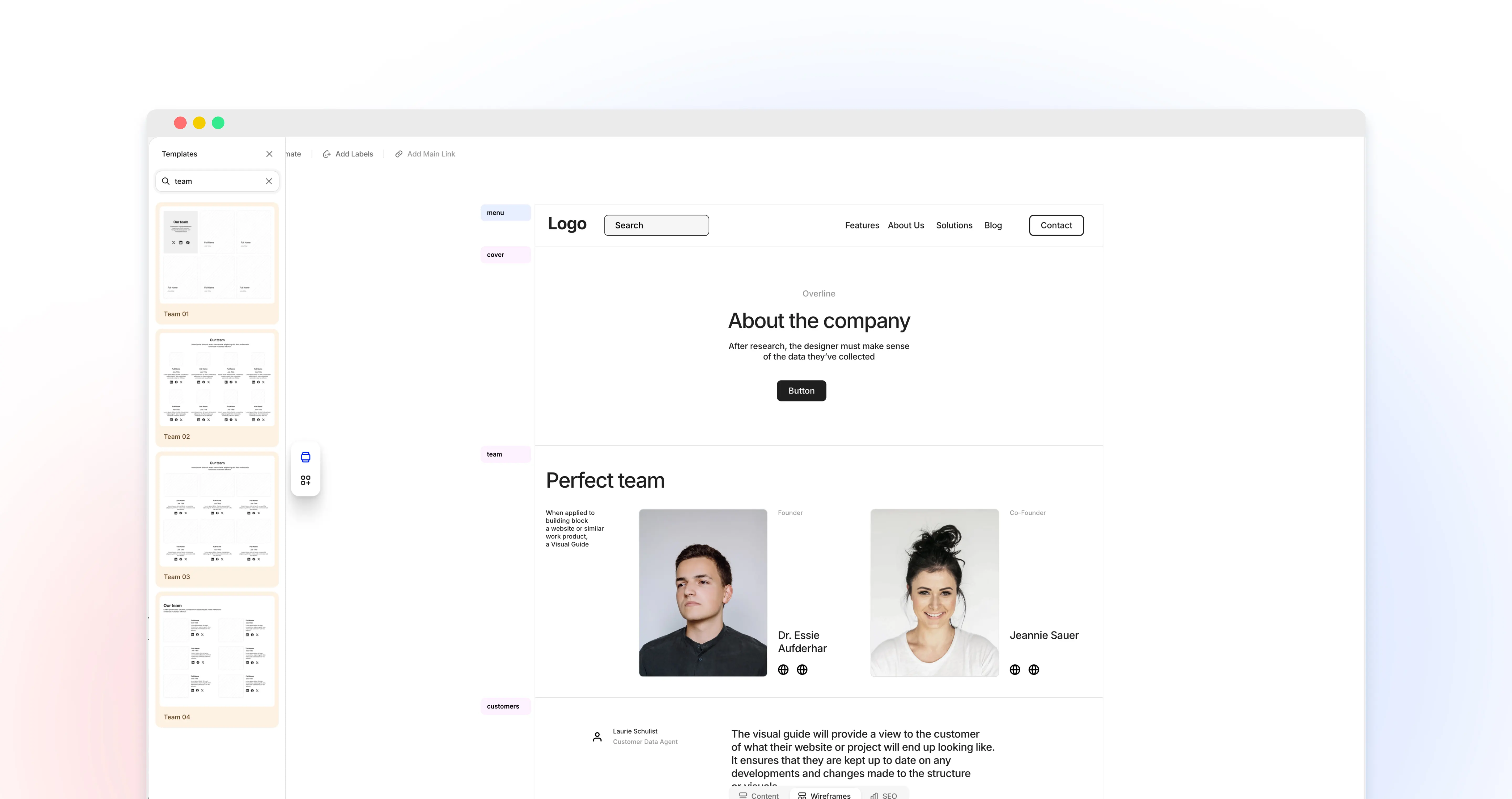
Mid-fidelity wireframes allow you to add more detail to your project. They include a more precise representation of the layout, including specific content blocks and placeholder text. These wireframes help you bridge the gap between conceptual ideas and detailed designs, allowing for better feedback and refinement.

High-fidelity
High-fidelity wireframes are detailed and closely resemble the final product. They include precise placement and detailed content and may even include basic interactive elements. You can use these wireframes later in the design process to finalize the layout and gain stakeholder approval.

Key Elements of a Wireframe
When creating wireframes, you should add key elements to ensure they are complete and useful. These elements help developers and designers convey structure, navigation, content, interactivity, and additional notes.

Layout and Structure
Layout and wireframe determine how different elements are arranged on a page. This includes placing headers, footers, sidebars, and main content areas. If you structure your layout well, it will ensure that information is presented clearly and logically, which improves usability.
Navigation
Navigation elements guide users through a website or application. These include menus, links, and buttons. Clear and intuitive navigation is essential for a positive user experience, making accessing the information they need easier.
Content Placeholders
Content placeholders indicate where text, images, videos, and other media will be placed. These placeholders help you visualize the content distribution and ensure the layout matches the intended message. They may include dummy text and images to give a realistic feel to the final design.
Interactive Elements
Interactive elements such as buttons, forms, and sliders are critical to the user experience. Adding these elements to your wireframes will help you plan the user experience and ensure functionality is seamlessly integrated into the design.
Annotations
Annotations provide additional information and context about specific elements of the framework. These may include notes about functionality, behavior, or design intent. Annotations can help you and your team understand the rationale behind design decisions and ensure that the final product meets the project's goals.
Examples of Effective Wireframes
Let's check several examples of well-thought-out wireframes for different types of websites.
Landing Page Example
Since this page should effectively encourage the user to do something subscribe, buy a product or service, sign up for a consultation, or something else, first of all, you have to place the CTA (this could be a feedback form, an order button, etc.) in such a way that the user does not have to take any additional actions to access it scroll down the page, open a list, and so on. Other mandatory elements will be a list of benefits (valuable for the end user) and a USP in general, nothing superfluous.

News Website Example
On news portals, three key elements are snippet blocks, as well as search and filters that will help users find what they need in a matter of seconds. Please note that the search bar should be accessible to the user from anywhere on the website.

Moodboard Example
In moodboards, it is important to maintain an optimal balance between creativity (which is what they are intended for) and structure – the most priority blocks, such as the image catalog and search, should be noticeable due to their position, size, and color scheme.

E-commerce Site Example
This type of website should have extremely simple user flows so that users can add a product to the shopping cart or complete the checkout process in no more than three steps. This will be facilitated by proper structuring of the product catalog, placement of the search bar in a visible place, implementation of a flexible filtering system, as well as providing unregistered users with the ability to quickly purchase.

Corporate Website Example
Since the main challenge in creating an effective wireframe for a corporate website is to maintain brand identity without compromising usability, designers will have to focus on building a simple hierarchy that would allow users to perform any target action in no more than three steps.

Portfolio Example
The portfolio website is very similar in its wireframes to those created for moodboards. Here, too, you should focus on visualizing cases using snippets and allowing users to quickly navigate among them using search and filters.

Blog Example
Blogs typically contain start screens with snippets of posts, a search, a user profile with settings, and a post-placement screen. If you are going to launch a multi-user platform, there may also be a search and filtering system for other blogs.

Social Network Example
This type of website usually includes a registration/login window, chats (private and public), a user account with settings, a directory with other users, and a search with filtering options.

Mobile App Example
Mobile applications can have very different features, but their essential components are usually a user registration/authorization screen, a user profile, and functional screens.

Dashboard Example
As an information management solution receiving data from a database to provide data visualizations, a dashboard should first provide its users with all the main tools for its management and processing. At the same time, the central role should be left to the visualization window.

Tools for Creating Wireframes
Flowmapp provides the perfect wireframing tool with several key features to improve your design process. One of the standout features is the huge library of templates suitable for different types of projects. This library, combined with a built-in smart editor, allows designers to quickly adapt templates to meet specific project needs, saving time and effort during the initial design stages.
Another significant advantage of Flowmapp is its presentation mode, which allows you to share wireframes as real clickable web pages via a link. This feature is especially useful for demonstrating wireframes to clients and stakeholders, offering an interactive experience that closely simulates the final product. Flowmapp's template editor makes it easy to change text, link to pages, and add images, ensuring that wireframes are a detailed and accurate representation of the intended design.
You can also add any content, be it sharing ideas, taking notes, or describing blocks of pages for teammates. In addition, Flowmapp's ability to connect to a sitemap will allow you to create a complex visual structure of your website in one place, making it easier to manage and visualize your entire project.
Best Practices
To create effective wireframes, you must follow best practices that ensure clarity, consistency, and user-centered design. These techniques help streamline the design process and develop wireframes that convey the design vision.
Clarity and Simplicity
Wireframes should be clear and simple, focusing on the main elements and avoiding unnecessary details. This helps stakeholders quickly understand the layout and functionality without getting distracted by design aspects.
Consistency
Maintaining consistency across all wireframes ensures a consistent user experience. Use standardized elements such as buttons and navigation menus to create a consistent look and feel that intuitively guides users through the interface.
Feedback and Iteration
Regularly incorporate feedback from stakeholders and team members, and be prepared to reuse your wireframes. This collaborative approach helps identify potential problems early and ensures that the final product meets everyone's expectations.
User-Centric Design
When designing wireframes, keep the end user in mind. Focus on creating a user-friendly experience that meets their needs and preferences. This user-centric approach ensures that the final product is both functional and satisfying to the target audience.

Conclusion
We've examined the basic aspects of creating wireframes and can conclude that they are invaluable tools in the design process. They provide a clear visual representation of a project's structure and functionality.
Wireframes serve as the basis for effectively communicating design progress to the client. You can create wireframes that lay a strong foundation for a successful project by focusing on clarity, consistency, and user-centered design. Adopting these principles will ensure that your wireframes convey the design vision and help streamline the design and development process.
If you want to make the wireframing process faster and more convenient, you can use the Flowmapp tool, which was created to build ideal wireframes.


