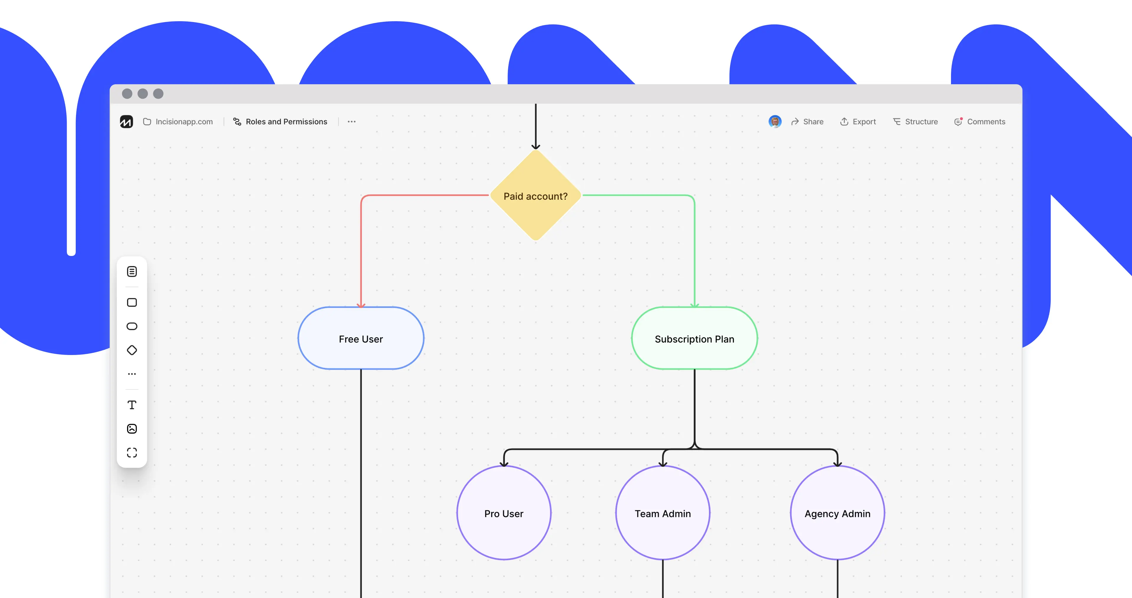
User Flow is basically a version of a classic Flowchart that is adapted for modern tasks of any UX – specialist. The most popular definition of Flowchart is as follows.
A flowchart is the graphical or pictorial representation of an algorithm in the form of blocks (graphic symbols) that are interconnected with the help of transition lines (communicators), each of which corresponds to one step of the algorithm. For the convenience of reading the Flowchart, there is a description of the corresponding action inside the block or next to it.
Flowchart, Application in Practice
Flowcharts are applied in different fields of activity. For example, they are used in programming and process documentation for more than a decade. Like other diagrams, Flowcharts are used to visualize the processes in order to find out their non-obvious features and hidden flaws.
User Flow Diagram Designing Principles
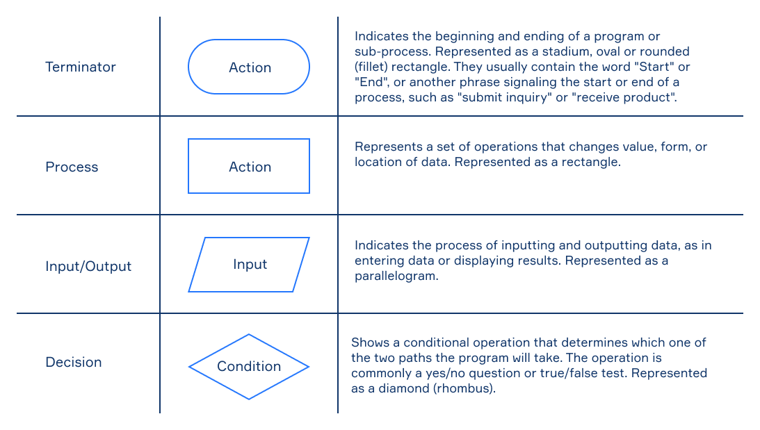
Currently there are no particular set of rules regulating the work with the User Flow Diagram. However, the Diagram inherits key features of the Flowchart. Because of this, there is an unwritten rule in a professional environment – to use the principles of classic Flowchart designing when creating User Flow Diagrams. Flowchart, in its classic sense, is widely used nowadays, and the decades of diagram usage make it easy and understandable for everyone. Therefore, it is the one of the easiest ways to present your idea to a Client or developer.
The key principles of using the most popular Flowchart elements are given in the following table:

The Diversity of User Flow Diagram Usage
Each new product begins with its conceptualization. Following this logic, the User Flow Diagram is the way to understand the product through the eyes of the user.
Despite the fact that User Flow is a tool the actions of which are not limited to the first stages of design-thinking, the User Flow methodology should be implemented in the project as soon as possible. Such advice is due to a rational desire to reduce development costs by identifying errors during design process. However, if for some reason the Diagram was not made at the very beginning, it still needs to be constructed. The diversity of User Flow allows you to implement the methodology at any stage of product development. No matter which stage of development you are at – the User Flow Diagram is still the easiest and cheapest way to identify errors in your project.
Description of the case
In this section we will compare the performance of several tools that are used to design User Flow. But before we begin, you need to examine the case that will be used for comparison.

The diagram shows a scenario where the entry point is “the user who heard about the application from his friend, who has motivated him to install it”. As the diagram shows, he had downloaded a mobile application to his device and completed the registration, and then made the first purchase in an online store and arranged a delivery. Because of the diagram, we can easily trace and analyze the entire user route, evaluate the conditions the user is faced with and plan user’s decisions, in order to bring him to the final goal as quick and easy as possible, providing a good UX.
Defining Comparison Criteria
I used the diagram reviewed above to compare between four tools that are used to design the User Flow - FlowMapp, Whimsical, Miro and Lucidchart. From my point of view, the complexity of the considered diagram is optimal for the comparison, since the potential of its designing requires the UX-specialist to implement the User Flow. You can see the final outcome of each tool on the corresponding links: FlowMapp, Whimsical, Miro, Lucidchart.
The following comparison criteria were defined
Dashboard, Workflow and Pricing. The criteria were not chosen randomly, each of them may be decisive in the matter of subscription. Dashboard is the foundation of convenient management of a large number of projects, and the basis of clear service navigation. Workflow should be thought out by the developers and provide a convenient model of user-service interaction. Pricing is the most ambiguous criterion, and we will do our best to choose the best service for each particular situation.
Top Flowchart Tools Comparison
Dashboard
The logic of dashboard organization dashboards in the reviewed services can be divided into two types. Lucidchart and Whimsical display all the previously created diagrams in one window and provide an opportunity to create a new one by selecting its type in the top panel.
FlowMapp and Miro use a different model of organizing the diagrams you have created. The diagrams here are distributed by “Projects” in FlowMapp and “Board” in Miro.
It should be noted that it is also possible to group the created diagrams in Whimsical, further distributing them into groups, which is not possible in Lucidchart. Taking into account the fact that one Flowchart is often not enough within a project, the Lucidchart’s dashboard interface looks unreasoned, overloaded and may complicate the navigation process within long-term and extensive projects. Distribution by projects in FlowMapp, Miro and Whimsical, on the other hand, makes navigation quick and easy.
Workflow
Considering the workflow of a particular tool, it should be taken into account that many users are looking for a service to create a Flowchart as an alternative to Sketch or Figma, where it is difficult to edit a large diagram or there is no possibility to work as a team. If you ever tried to create a Flowchart in one of these tools, you must have noticed that these very popular graphic editors are not suitable for such a task. Most of the functionality of the above mentioned graphic editors is useless, and the format of free transformation of objects on artboard increases the amount of work, forcing you to concentrate on trivial things like lines alignment, elements dragging and form editing. Using Sketch or Figma, we are faced with the same problems when we also want to edit a diagram, which we have to do quite often.
Miro
This is a good tool that can help you solve a lot of problems, but, unfortunately, is not suitable for professional work with Flowchart. The main problem of Miro is the logic on which the UX tool is built. Miro is a “whiteboard” which has several templates, including Flowchart, on the basis of which the User Flow can be created. The whiteboard principle in its essence does not provide an alternative to overloaded graphics editors like Sketch and Figma, forcing the user to face the same problems like resizing, elements positioning. It causes endless cleaning up processes, contributes to procrastination, and takes a lot of time. Also, a large number of templates and functions may scare a new user, despite the generally modern UI.
Whimsical
This is a simplified RTB - just as much as needed. Despite the fact that Whimsical adopts the main disadvantage of RTB - the principle of constructing a diagram on the “whiteboard” basis, it is pleasant to see how they make a good product. Whimsical's well-turned decision is that they disposed of all the useless functionality that the RTB is filled with, leaving only the essential functions. Useful functionality, hotkeys, and, without a doubt, a good UI make this tool suitable for professional usage. One of the drawbacks is the poor logic of connectors binding and their weak customization.
Lucidchart
Among the tools reviewed by this article, this one is the oldest. Having a huge experience, Lucidchart undoubtedly had the opportunity to make a good product, but, unfortunately, they did not take advantage of this opportunity. Lucidchart is hard to work with. It is very slow; the interface is overloaded in the best traditions of mid-2000s Microsoft Office suite. Among other things, there are no basic tools; even the element transformation tool is missing. And of course, as with all the services that are built on the basis of a “whiteboard” it is inconvenient to unite connectors, the customization is poor and there is also the lack of connecting elements. Lucidchart is unable to compete with non-professional tools like RTB, nor with the graphic editors mentioned earlier.
FlowMapp
The logic of FlowMapp operation is fundamentally different from all the tools analyzed above. Unlike other tools, FlowMapp has a number of restrictions. These restrictions are designed to help you focus on your creative work. On FlowMapp, elements and lines are automatically drawn and connected in the right places of the grid, providing you with a flawlessly clean scheme. FlowMapp has a very simple, effective and intuitive interface that provides the user with all the necessary information. The creation of elements does not force you to do anything unnecessary, due to the automatic positioning of blocks on the grid. If you hover the cursor over any empty space, you are immediately prompted to create a new element that you can easily move around the grid or transform. You can also customize connectors and linking elements with ease.
Pricing
Before you subscribe to one of the tools, it is vital to estimate the amount of work that needs to be done. If you need a Diagram in order to structure your idea, and plan to use it as some sort of alternative to Mind map, then you can use any service from this list. In this case, each service provides a Free-account that will allow you to create at least one project for free. Keep in mind, that Lucidchart has a limit on the number of elements created inside the Diagram.
If you need to create a full-fledged User Flow and you plan to continue working on it as a team or if you have to show it to the Client, and most importantly, if you want to transform it and approve edits, you should definitely look towards FlowMapp and Whimsical. The minimum subscription price for Whimsical is $12. Once purchased, you will be able to create Flowchart, Wireframe, Stickynotes, and Mind map. In the case of FlowMapp – only $12,75 for a Pro account. It is the minimum entry threshold that will provide you with a professional tool, the functions of which are not limited to Diagram creation. The FlowMapp will help you create a visual Sitemap, each page of which will have a chat, structure and description of the page. There is also the ability to attach files and links. All this combined allows you to structure communication with your team and the Client by context, as well as store the source code of the project in one place, eliminating the need to pay for a Dropbox or any other cloud storage.
The minimum subscription price for one people on team for Miro is 10$. A Lucidchart Pro account will cost you $11.95 per month.
In conclusion
Apparently, every good product started with the right approach to its design. Flowchart is a tool that had passed the test of time. The experience of using this tool for decade proves its effectiveness in designing new products and upgrading already existing ones. As seen from this article, there are a lot of modern tools that allow you to create Diagrams and work on them as a team. The usage of web-based tools that are meant to create a User Flow significantly reduces the amount of time spent on the Diagram creation; it also allows you to detect and eliminate possible errors in the process of design, and ultimately it helps to reduce the costs when it comes to product development and elaboration.

